World fertility by region:
Before I show you these numbers, let me tell you how to get them. Digging them up on the internet was taxing. The analysis was child’s play.
Go to UN.org
Click the English “Welcome” button.
Click the “search” button.
Click “advanced search.”
In the pane “results with all the words” enter “world fertility.”
Click the “search” button.
Scroll down to the title “World Population Prospects: the 2006 Revision Population Database.”
Click the title.
Click the “Panel 2, Detailed Data” button.
In the “variables” pane, select “total fertility.” In the “country, region” pane select “world.”
Click the “display” button. That is the total world fertility we looked at earlier.
Click the “back” arrow on your search engine at the top of the page.
Now keep the variable pane unchanged, but enter “more developed regions,” “less developed regions excluding least developed countries” or “least developed countries” in the “country, region” pane.
Click the “display” button.
That is where these numbers came from.
Here is what I copied.
More developed regions:
Period |
Total fertility |
1950-1955 |
2.84 |
1955-1960 |
2.82 |
1960-1965 |
2.69 |
1965-1970 |
2.37 |
1970-1975 |
2.13 |
1975-1980 |
1.91 |
1980-1985 |
1.85 |
1985-1990 |
1.83 |
1990-1995 |
1.68 |
1995-2000 |
1.55 |
2000-2005 |
1.56 |
Less developed regions excluding least developed
1950-1955 |
6.09 |
1955-1960 |
5.92 |
1960-1965 |
5.94 |
1965-1970 |
5.90 |
1970-1975 |
5.25 |
1975-1980 |
4.42 |
1980-1985 |
3.87 |
1985-1990 |
3.55 |
1990-1995 |
3.11 |
1995-2000 |
2.80 |
2000-2005 |
2.59 |
Least developed regions
Period |
Total fertility |
1950-1955 |
6.67 |
1955-1960 |
6.70 |
1960-1965 |
6.76 |
1965-1970 |
6.73 |
1970-1975 |
6.61 |
1975-1980 |
6.39 |
1980-1985 |
6.28 |
1985-1990 |
6.00 |
1990-1995 |
5.68 |
1995-2000 |
5.29 |
2000-2005 |
4.95 |
“Total fertility” means the number a woman can expect to have in a lifetime given the ages of women in the place during the time considered and the rate at which they are having children. As you can see at a glance the fertility of developed countries is 1.56, and except for a tiny upturn in the past five years is dropping.
Turning that around might be possible and I think major efforts should be made to save those countries. But consider how problematic it is. If the number of offspring per woman is about 1, which it is in many places and looks like it soon will be throughout the regions reported here, the obvious move is to expect everyone to marry a third cousin, in line with the evidence from the Iceland study. Under conditions of one child per woman, a person has no siblings, 2 first cousins, 4 second cousins, and 8 third cousins. Of those only 4 will be of the opposite sex.
So far it looks exceedingly difficult but worth a try. But remember, that data was collected in Iceland, where just about everyone is Icelandic. It is the most homogenous nation on earth. Most of the more developed regions will typically have far more genetic diversity. Third cousin might not be close enough. It might be necessary to move in to second cousins. There are two, so it is still not impossible. But as the Icelandic data shows, marrying a second cousin produces a serious reduction in the number of grandchildren.
That reduction must be caused by expressing recessive deleterious genes, each rare but the total number very high. Since the fertility depression is being caused by the mismatch of genes that need to be fine tuned to each other, having nothing to do with recessive deleterious genes, no amount of diversity of each individual in a couple is likely to reduce the second generation cost of marrying second cousins. Sorry. No way out. At least no guaranteed way out. Since the cost of not even trying is extinction, it needs to be tried, but without assurance of success.
In fact the fertility of the less developed regions excluding the least developed countries is by now 2.59 and falling. It may take a whole generation to turn that around, by which time their plight will be the same as the plight of the more developed regions.
In short, all but the least developed countries may be a write off.
If that is true, then our most hopeful goal is to transfer our technology and our science to the least developed.
The least developed countries are:
|
|
Afghanistan |
Malawi |
|
Angola |
Maldives |
|
Bangladesh |
Mali |
|
Benin |
Mauritania |
|
Bhutan |
Mozambique |
|
Burkina Faso |
Myanmar |
|
Burundi |
Nepal |
|
Cambodia |
Niger |
|
Cape Verde |
Rwanda |
|
Central African Republic |
Samoa |
|
Chad |
São Tomé and Príncipe |
|
Comoros |
Senegal |
|
Democratic Republic of the Congo |
Sierra Leone |
|
Djibouti |
Solomon Islands |
|
Equatorial Guinea |
Somalia |
|
Eritrea |
Sudan |
|
Ethiopia |
Timor-Leste |
|
Gambia |
Togo |
|
Guinea |
Tuvalu |
|
Guinea-Bissau |
Uganda |
|
Haiti |
United Republic of Tanzania |
|
Kiribati |
Vanuatu |
|
Lao People's Democratic Republic |
Yemen |
|
Lesotho |
Zambia |
|
Liberia |
Madagascar |
The total population of these regions is 766,816. Numerically, that is not a bad number. The world could sustain it using only traditional means. And it is to that population that the torch must be passed. That is our last, best hope. The problem is that they are not going to be very enthusiastic. They aren’t interested. They stay to their traditions and their tiny communities. That is why they are doing so well. So until we get this whole issue sorted out and are sure of the way forward, the message to them must be, “Well done. Power to you. We’ll help you any way we can, but don’t make any great changes just now. You are far better off than we.”
Here is what we get when we graph the numbers. Everyone is in decline. We knew that.
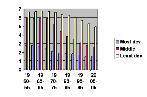
Chart of fertility on the vertical axis against time on the horizontal axis for three regions of the world: more developed regions, less developed regions excluding least developed regions and least developed regions. Time is in dates. Fertility is in number of offspring per woman.
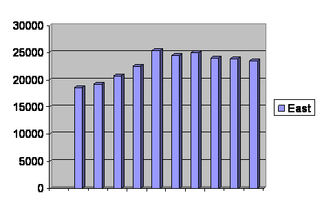
What we can now do is take segments of the three graphs, where they have about the same fertility and paste them together. This gives us the big view.
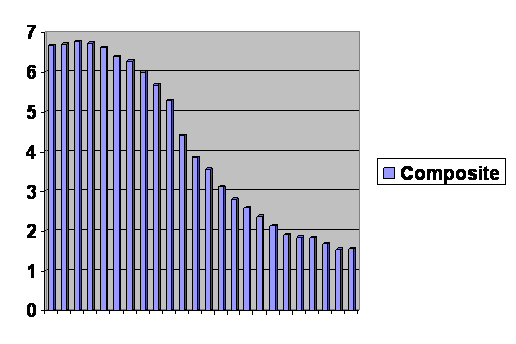
Composite graph of least developed counties from 1950 through 2000, less developed regions excluding least developed countries from 1975 through 2005, and more developed regions from 1970 through 2005. The vertical axis is number of offspring per woman; the horizontal axis is discontinuous, but each bar represents a five year increment.
I don’t know about you, but it all looks like the same curve to me. If I had not told you, you would have difficulty deciding where one population ends and another begins. In other words, the fertility of humans in the richest, best educated, most modern societies with the most lavish social safety net is governed by the same rules as what the fertility was 50 years ago in what are now still the least developed countries with education, wealth and social safety nets that were probably unenviable.
I have said in the past, and I shall stick to it, that fertility decline is about linear. And so it is over a short time. But over the long view, it is S shaped. It is initially rather flat, goes into a dive and begins to pull out of the dive and approach leveling off only when the reproductive rate is below replacement. Of course we have seen that before, so it is no surprise.
But we now have data in a region where we had none before. We can look at where fertility begins to drop. You remember this curve.
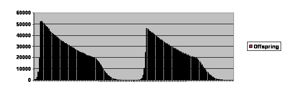 Computer simulation of a population permitted to rise to 20,000 parents. Number of offspring on the vertical axis, and generation number is on the horizontal axis. The axis is not labeled, but each cycle is about 80 generations long, far longer that what is seen in real life.
The curve, as I have mentioned, is truncated, since the computer cannot handle the number crunching for a population much over 20,000, so the number of parents was limited to that. Look at the second cycle. From the peak to about 30,000 offspring it is very close to being a linear decline. Then it begins to level off, particularly after it has dropped below 20,000 offspring per generation, or replacement level. This closely matches the real world data.
We have already pointed out that the recovery from collapse and a period of no growth seems to follow an exponential rise, just like the black footed ferrets. Here is a closer look at the same numbers.
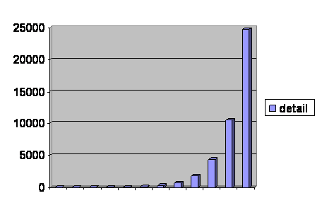
Detail of a region of the second cycle in the chart immediately preceding showing the rapid rise after a period of no growth. Number of total offspring is on the vertical axis. Generations are the horizontal axis, with one bar per generation.
It does look like exponential growth, but is it really?
Here is a graph in which we calculated the number of offspring per parent during that period of rapid growth.
Offspring per parent in the computer simulation during rapid growth. Vertical axis is offspring per parent. Horizontal axis is generations.
I omitted the first generation. It was actually the last bounce of the period of no growth just preceding. What we see ought to be a horizontal line if indeed growth is exponential. The number of offspring per parent should be constant. But it is not. Actually it rises for a bit and then begins to fall. Fertility goes over a hump.
Now go back and look at the composite graph, and there is much the same hump at the highest fertility. So it is true. The same model predicts the fertility of contemporary developed societies and the fertility of least developed societies 2 generations ago.
The crisis the model predicts is real.
There have been 237 visitors so far.
Home Page.